The QA Metrics That Move Decisions
Why most quality dashboards get ignored in the executive review — and what to track instead
There is a specific silence I've learned to recognize.
It happens in the quarterly business review, after the QA dashboard goes up on the screen. Test cases executed: thousands. Automation suites: dozens. Pass rate: 98%. Everything green. And then someone at the head of the table — a VP, a CTO, once a Chief Actuary — asks the only question that actually matters:
"So are we going to ship clean, or not?"
The dashboard, for all its green, has no answer. Because the numbers on it measured how busy the QA team was, not whether the product was safe to release. That gap — between activity and outcome — is the difference between a QA function that gets a seat at the table and one that gets managed as a cost center.
This is a walkthrough of the metrics actually worth tracking, the formulas behind them, where the data comes from. The part most articles skip — how the same number serves two very different readers: the executive deciding whether to release, and the engineer deciding what to fix on Monday.
Activity is not outcome
A team can write 2,000 test cases that exercise nothing risky and report a 99% pass rate while the product bleeds defects in production. Volume tells you the team was busy. It tells you nothing about risk, readiness, or cost. I call these vanity metrics — not because they're fake, but because they flatter the team without informing a decision.
The metrics worth building a program around share one property: someone changes their behavior because of the number. An executive delays a release. An engineer adds coverage to a specific module. A director reallocates two people. If a metric moves and no decision changes, stop reporting it.
Everything below passes that test.
Defect Escape Rate — the readiness number
If I could keep only one metric, this is it. Defect Escape Rate (DER) measures the percentage of defects that slipped past QA and were discovered by customers in production.
Formula:
Defect Escape Rate = Defects found in production
                     ─────────────────────────── × 100
                     Defects found in production + Defects found pre-release
Where the data lives: Your issue tracker. In Jira, this means tagging every defect with an environment found field — pre-prod vs. production — and enforcing it at ticket creation. Production defects are cross-referenced against incident tickets so nothing gets miscounted or hidden. The discipline is in the tagging; the math is trivial once the data is clean.
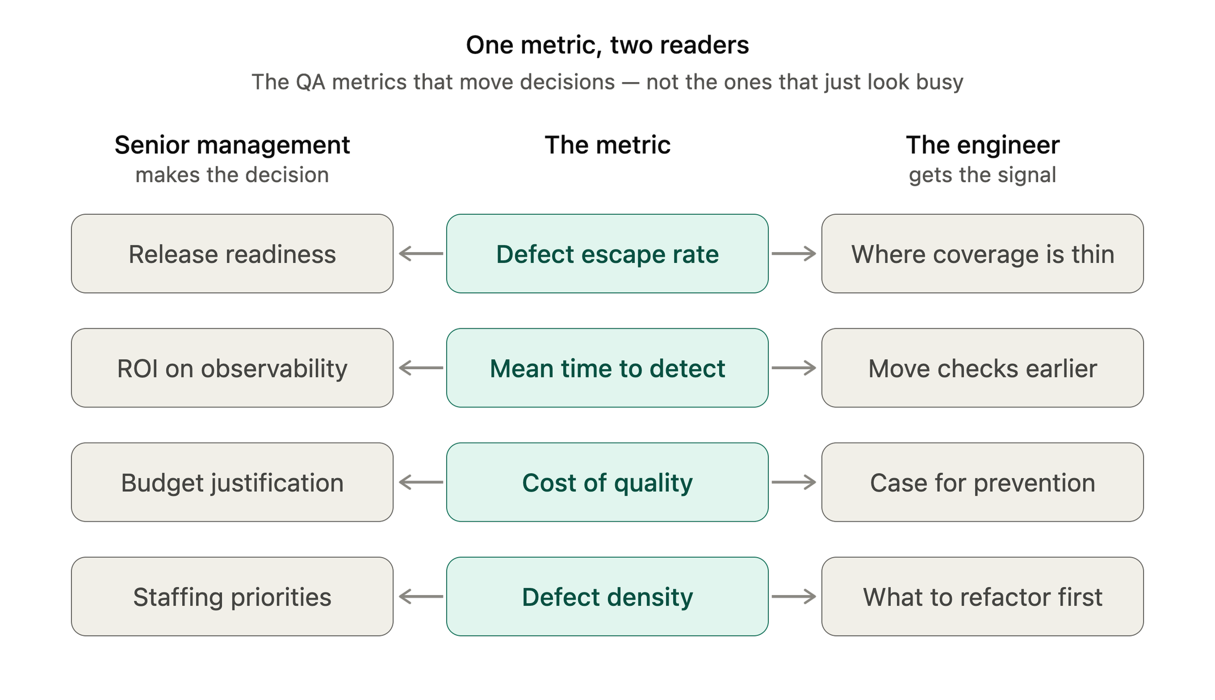
What it tells senior management: This is a release-readiness and process-health number. A DER trending up means the safety net has holes and every release is a gamble. Leadership uses this to decide where to invest: more coverage, better environments, or a hard look at the release gate.
What it tells the IC: It's a coverage map, not a report card. When escapes cluster in one service or one workflow, the engineer knows exactly where the test layer is thin. Framed this way, DER drives coverage decisions instead of blame — which matters, because the moment a team feels punished by a metric, they start gaming it.
Mean Time to Detect — how fast the net works
Escapes tell you that something got through. MTTD tells you how long it lived before anyone noticed.
Formula:
MTTD = Σ (Detection time − Introduction time)
    ──────────────────────
                 Number of defects
A note on honesty: true "introduction time" is hard to pin down. Detection time comes from the defect or incident creation timestamp. State the proxy you're using and stay consistent — a slightly imperfect measure tracked the same way every sprint is far more useful than a perfect one you can't compute.
Where the data lives: Deployment logs and commit history for the start point; Jira or your incident tool (PagerDuty, Opsgenie) for detection.
Management read: MTTD is the return on your observability and shift-left investment. Detection times shrinking means monitoring, alerting, and earlier test stages are working. Growing means blind spots. This justifies spend on tooling and earlier testing in language a finance-minded executive understands.
IC read: A long MTTD on a class of defects is a signal to move that check earlier — from manual regression into an automated pipeline stage, or from post-deploy monitoring into a pre-merge gate.
Mean Time to Resolve — the recovery number
MTTR measures how long it takes to close a defect once detected. (Worth distinguishing from the SRE "mean time to restore" — resolve is about fixing the defect; restore is about recovering service. Track whichever matches the conversation, but don't conflate them.)
Formula:
MTTR = Σ (Resolution time − Detection time)
       ───────────────────
                Number of defects
Where the data lives: Jira status transitions. Every ticket already carries a timestamp for each status change; the gap between Detected/Open and Done/Closed is your raw data. Tools like eazyBI read these transition histories directly out of Jira, so once your workflow is clean, MTTR builds itself.
Management read: Operational risk exposure. A high MTTR on high-severity defects means customer-facing problems persist longer — a direct line to churn and, in regulated products, to reportable events. It also exposes triage and process bottlenecks worth resourcing.
IC read: Where the pipeline from found to fixed is clogged — waiting on triage, on environments, on a review queue. ICs use it to argue for the unglamorous fixes that speed everyone up.
Defect Density — where the fires start
Not all code is equally risky. Defect Density normalizes defects against size so you can compare modules fairly.
Formula:
Defect Density = Total defects
                 ────────────────────
                 Size (KLOC, or story points, or per feature)
Kilo-lines-of-code (KLOC) is the classic denominator, but for teams that don't track LOC cleanly, defects per story point or per feature area works and is often more meaningful.
Where the data lives: Defect counts from Jira, mapped to modules via component tags; size from the repository (LOC) or from your backlog (story points per epic/component).
Management read: A hotspot map. If one service carries three times the density of the rest, that's where architectural debt or ownership gaps live. This informs staffing and refactoring investment.
IC read: The clearest possible pointer to what needs more tests, a refactor, or a design conversation — before it becomes the next incident.
Cost of Quality — the number executives actually feel
Every metric above is a quality number. This is the one that translates quality into money, and it's the reason QA gets funded.
Cost of Quality breaks spend into four buckets:
Prevention — design reviews, training, better tooling (money spent so defects never happen)
Appraisal — testing, inspections, audits (money spent finding defects)
Internal failure — rework on defects caught before release
External failure — defects that reached the customer: incidents, support load, remediation, and in regulated industries, penalties
Cost of Quality = Prevention + Appraisal + Internal Failure + External Failure
The insight that makes this land in a boardroom is the 1:10:100 rule. A defect that costs roughly 1 unit to fix at the requirements/design stage costs about 10 units to fix during build and QA, and 100 units once it reaches production. The ratio is directional, not precise — but it reframes the entire QA conversation. You are no longer asking for budget to "do more testing." You are showing that a dollar of prevention displaces a hundred dollars of failure.
Where the data lives: This one takes assembly. Prevention and appraisal come from time tracking and tooling spend. Internal failure comes from rework hours logged against pre-release defects. External failure comes from incident cost — support hours, engineering hours, and any customer or regulatory remediation. Tag defects by the stage they were caught so you can slot each into the right bucket.
Management read: This is the metric that changes budgets. It converts "QA is expensive" into "here is what quality failure costs us, and here is the ratio at which prevention pays it back." Nothing else we track moves executive decisions as reliably.
IC read: It makes the case for the work engineers already want to do — writing the test earlier, fixing the flaky suite, hardening the deploy — by showing that early effort is worth 100x its cost downstream.
The vanity metrics to retire
To make room for the above, stop reporting these as if they mean something:
Raw test case count. Measures typing, not coverage or risk. A smaller suite targeting real risk beats a bloated one every time.
Naked pass rate. A 99% pass rate on tests that assert nothing is green theater. Pass rate is only meaningful alongside what the tests actually cover and how flaky they are. Watch flaky test percentage instead — non-deterministic tests quietly destroy trust in the whole suite.
Automation script count. "We have 2,000 automated tests" says nothing. "Our automation covers 80% of the critical revenue path" says everything.
I learned this the hard way. Early in my career I proudly reported a climbing pass rate to leadership — until a release with a 97% pass rate shipped a defect that took down a core workflow. The tests passed because they weren't testing the thing that broke. Pass rate had become a comfort blanket, not a signal. That was the release that taught me to measure escapes, not passes.
Building the pipeline
None of this works without clean data plumbing. The stack to run:
Jira as the source of truth. Enforce the fields the metrics depend on — environment found, severity, component, stage caught — at ticket creation. If the data isn't captured at the source, no dashboard can reconstruct it later.
eazyBI for the math and the visuals. It reads Jira's issue and status-transition history directly, which means MTTD, MTTR, escape rate, and density calculate off real workflow data rather than hand-maintained spreadsheets.
A reporting cadence matched to the audience. ICs and leads see the operational metrics weekly, in the sprint rhythm. Executives see the outcome and cost metrics quarterly, trended over time. Same underlying data, two altitudes.
The unglamorous truth: 80% of the work is data hygiene, not analysis. Get the tagging discipline right and the insights fall out. Skip it and you'll spend every review defending your numbers instead of using them.
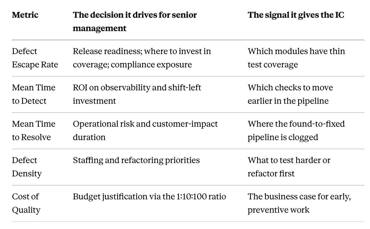
One metric, two readers
The through-line of everything above is that a good metric serves both altitudes at once:
Executive takeaways
Measure outcomes, not activity. If a number goes up and no one changes a decision, it's decoration. Escapes, detection time, and cost of quality change decisions. Test counts don't.
Every metric needs two readings. The executive read justifies investment; the IC read directs the work. A metric that only serves one altitude will be ignored by the other.
Translate quality into money. Cost of Quality and the 1:10:100 ratio are how QA stops being a cost center and starts being an investment thesis.
Data hygiene is the real work. Clean tagging at the source beats clever analysis on dirty data every time.
Never punish the team with a metric. The moment a number becomes a weapon, people game it, and you lose the signal you built it for.
The green dashboard isn't wrong. It's just answering a question no one asked. Measure the things that answer "are we going to ship clean?" — and you'll never sit through that silence again.